The Place-Based Carbon Calculator estimates the carbon footprint of every neighbourhood in Great Britain, breaks it down into housing, transport, and consumption, and tracks how it has changed since 2010. For a full explanation of the tool please see the manual. You can also access sections of the manual via the help buttons ().
How can we improve this tool?
We would love to hear how you are using Carbon & Place and how we can make our tools more useful. If you have found an error in the data or a bug in the tool, you can also report it on GitHub.
Last updated: . If the page looks out of date, reload it while holding Shift (or press Ctrl+F5 on Windows, Cmd+Shift+R on a Mac) to bypass your browser cache.
We use cookies to measure how you use our website so we can understand how you interact with it, which helps us to make improvements. Find out more.
Basemap
Place names
Anti-alias
Layer Controls
Dasymetric
show names
show names
show names
show names
×
Help content loading…
Understanding the grades
What does this grade mean?
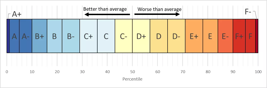
Many values carry a grade from A+ to F- to show how this area compares with the rest of Great Britain. The grades are relative to the average neighbourhood: A+ to C- means a lower carbon footprint than average, and D+ to F- means a higher one. Because most areas sit close to the average, the middle bands are wide, each covering roughly 7% of neighbourhoods, while the bands at either extreme are narrow, so only about the lowest 1% receive an A+. Two things the grades do not mean are worth stating plainly. They are not a judgement of the people who live here, since much of what drives a footprint is the housing stock and the transport available. And an A+ does not mean the area is sustainable: meeting the UK's net zero commitment requires reductions in almost every neighbourhood, including the best-graded ones. Where data is missing or has been suppressed, NA is shown instead of a grade.
×
Zone Summary: XXXXX
The 2022 Census in Scotland changed Data Zone boundaries substantially; historical data has been adjusted onto the new boundaries
This LSOA had a complex boundary change between 2011 and 2021; historical data is taken from the closest matching earlier LSOA
This LSOA was formed in 2021 by merging two LSOAs; their historical data has been added together
This LSOA was formed in 2021 by splitting an earlier LSOA; its historical data has been divided between the new areas
In at least one year, no residents were recorded in this LSOA
In some years this LSOA records an unusually large number of company cars
In some years this LSOA gives unreliable per-person figures because its recorded population is very low
Overall Carbon Footprint
Simplified categories
NA kgCO2e per person
This tab summarises the total carbon footprint of the area named at the top of this report; the other tabs break it down and supply the context needed to interpret it. The underlying figures are published for neighbourhoods of roughly 1,500 to 3,000 residents (Lower Super Output Areas in England and Wales, Data Zones in Scotland) and are combined for any larger area shown here.
The bar chart shows the total carbon footprint per person in units of kilograms of carbon dioxide equivalent. The first bar is always this area. The bars beside it are comparisons, each labelled beneath the chart: the local authority this area sits in, neighbourhoods elsewhere in Great Britain that share its area classification ("Similar Areas"), and Great Britain as a whole. A comparison that does not exist for this report is left out rather than drawn empty, so you may see fewer bars: "Similar Areas" is a classification of neighbourhoods and has no counterpart for a ward, parish, constituency or council, and a local authority report has no parent authority to compare itself with. The Office for National Statistics area classification groups neighbourhoods into categories on the basis of social, economic, geographic, and demographic characteristics, so where the "Similar Areas" bar appears it is often the most informative comparison of the set, because it sets a rural neighbourhood against other rural neighbourhoods rather than against the country as a whole.
The horizontal black line represents the UK's target footprint per person set out in the Climate Change Committee's Sixth Carbon Budget, which covers 2033 to 2037. The line is a guide to the scale of the change implied by the UK's legal commitment to net zero by 2050, not a target set for this area. It is derived by dividing the national budget by population, which assumes every person reduces by the same amount; a fair local target would take account of income, housing, and the transport options actually available.
Overview Tables
Housing
Name
Grade
kgCO2e per person
Electricity
NA
Gas
NA
Other Heating
NA
Other Housing
NA
Transport
Name
Grade
kgCO2e per person
Car Driving
NA
Public Transport
NA
Van Driving
NA
Motorbikes & Company Car Driving
NA
Flights
NA
Vehicle Purchase
NA
Vehicle maintenance
NA
Consumption
Name
Grade
kgCO2e per person
Furnishings
NA
Food and Drink
NA
Alcohol & Tobacco
NA
Clothing
NA
Communications
NA
Recreation
NA
Restaurants & Hotels
NA
Health
NA
Education
NA
Miscellaneous
NA
Total consumption of goods and services
NA
Historical Emissions
This chart shows the average per-person carbon footprint in this area for each year since 2010, broken down into categories; the other tabs explain each category in more detail. The black horizontal line is a reference level, derived by dividing the national emissions allowed under the Climate Change Committee's Sixth Carbon Budget for 2033 to 2037 by the UK population. It is not a target set for this area, and it assumes an equal per-person share, which takes no account of income, housing, or the transport options available locally. It is included to give a sense of the scale of change implied by the UK's legal commitment to net zero by 2050: almost every neighbourhood in Britain currently sits well above it.
The Climate Change Act commits the UK to net zero by 2050, and the Sixth Carbon Budget requires a 78% cut on 1990 levels by 2035. National totals hide the local variation this chart reveals: the right priorities differ from place to place, which is why the Climate Change Committee argues for a bigger local role, estimating that councils have influence over roughly a third of emissions in their areas (Local Authorities and the Sixth Carbon Budget). Neighbourhood evidence like this helps target retrofit schemes, transport investment, and planning decisions where they will do the most good. You may also be interested in Barrett et al. (2022), which finds that UK energy demand could be roughly halved by 2050 through measures of this kind, and in the Energy Demand Research Centre's Place theme, which funds this tool.
The historical series combines measured domestic gas and electricity consumption published by DESNZ, transport estimates built from vehicle registrations and MOT odometer readings, and consumption emissions modelled by matching synthetic households to the Living Costs and Food Survey. Emissions factors follow the UK government conversion factors for each year. Modelled categories carry more uncertainty than metered ones, and pandemic-era years should be read with care. The full methodology is described in the manual and in Morgan (2026), and the code that produces these figures is published as the Carbon & Place analysis pipeline.
Transport
You may also be interested in the Transport and Accessibility Explorer, which shows the public transport frequency, vehicle ownership, and access to services behind these figures for the same neighbourhood.
Car Emissions
Carbon emissions from cars can be reduced in two main ways: lowering the emissions per mile driven, by improving fuel efficiency or switching to electric vehicles, and driving less. The Climate Change Committee has been clear that cleaner cars alone are not enough, and that meeting the UK's climate targets also requires some reduction in traffic. Electric cars remove exhaust emissions, but manufacturing them still produces substantial emissions, and all cars contribute to congestion, road danger, and particulate pollution from tyres and brakes; air pollution as a whole is estimated to contribute to a mortality equivalent of 28,000 to 36,000 deaths a year in the UK (UK Health Security Agency). Places become less car dependent when good public transport, safe walking, and cycling give people attractive alternatives.
Cutting car emissions needs action on both vehicles and traffic. On vehicles, the UK's zero-emission vehicle mandate and the planned phase-out of new petrol and diesel car sales drive the switch to electric, supported by charging infrastructure (Transport Decarbonisation Plan). On traffic, local authorities hold many of the levers: planning that puts homes near shops, schools, and jobs; bus priority; parking policy; and safe walking and cycling networks (Gear Change). Neighbourhoods with high car emissions on this chart are usually places where daily life currently depends on driving, so improving the alternatives matters as much as promoting cleaner cars. Two pieces of UK research are useful here: CREDS on how much car travel could realistically be avoided, and Mattioli et al. (2020) on why car dependence is reproduced by land use, industry, and policy rather than by individual preference alone.
Car emissions are estimated by combining the DVLA vehicle licensing statistics, which record the cars registered in each neighbourhood and their fuel types, with annual mileages derived from odometer readings in the anonymised MOT test data, an established method in transport research (Chatterton et al. 2015). The approach reflects the real local fleet rather than national averages. Its main limitations: vehicles are attributed to the registered keeper's address rather than where they are driven, cars under three years old have no MOT record and need modelled mileages, and the pandemic years disrupted both driving and testing. See the manual for details, or the analysis pipeline for the code itself.
Van Emissions
Vans are more complicated than cars because they are more often used for work rather than personal travel. Some neighbourhoods show exceptionally high van emissions because the data is based on the registered keeper's address: a company that registers its whole fleet at one address will inflate the result for that neighbourhood, even though the vans operate over a much wider area.
Van traffic has grown faster than car traffic for two decades, driven partly by online deliveries (DfT road traffic statistics), and electric vans have been slower to arrive than electric cars. The zero-emission vehicle mandate covers vans, and the Transport Decarbonisation Plan sets phase-out dates for new diesel vans. Local measures can also reduce van mileage: consolidation centres that bundle deliveries, cargo bikes for last-mile work in dense areas, and planning that provides loading space so vans spend less time circulating.
Van emissions use the same method as cars, combining vehicle licensing statistics with mileages from the anonymised MOT data. The known limitations are stronger here: the registered address often differs from where a van actually operates, producing spikes around depots and company offices, and the model cannot distinguish a plumber's van from a long-distance courier, whose annual mileages differ greatly. Van figures should therefore be treated as indicative, particularly where the value is unusually high; the report card flags neighbourhoods where the registered-keeper problem is known to be severe.
Motorbikes, Company Vehicles, and other types
This chart covers other personal vehicles, such as motorbikes and company cars. A few places show extremely large numbers of company cars, usually because a leasing company registers all its vehicles to a single address. In those cases we suppress the company car emissions from the total carbon footprint, since they clearly do not belong to local residents.
Company cars matter for decarbonisation because fleets buy around half of new cars in the UK, and those vehicles reach the second-hand market within a few years, shaping what everyone else drives. Company car tax is currently structured to favour electric vehicles (benefit-in-kind rules), which has made fleets the fastest-electrifying part of the market. Motorbikes are a small share of emissions; the more consequential policy questions concern how quickly fleet incentives convert into an affordable used electric car market.
Motorbike and company vehicle emissions come from the same combination of registration and MOT mileage data as cars, with company vehicles identified by their keepership. Because leasing companies can register thousands of vehicles at one address, the geographic pattern is less reliable than for privately kept vehicles, and extreme values are suppressed from the neighbourhood totals rather than being allowed to distort them. This category is context for the rest of the transport picture, not a measurement of local behaviour.
Public Transport
This category covers buses, coaches, trains, ferries, and other public transport. Per passenger mile, public transport is typically far lower carbon than driving or flying (UK government conversion factors), so areas where people travel mainly by bus and train tend to have lower transport footprints overall, even though their public transport emissions appear higher on this chart.
Shifting journeys from car to public transport cuts emissions, congestion, and pollution at the same time, but it depends on services being frequent, reliable, and affordable. Outside London, bus use has declined for decades alongside service cuts (DfT bus statistics); the national bus strategy and new franchising powers give local authorities more control over networks and fares. The Transport and Accessibility Explorer in Carbon & Place shows how service frequency in this area has changed since 2008, which is useful context for this chart.
Public transport emissions are allocated to neighbourhoods through the synthetic population model, using household spending on fares in the Living Costs and Food Survey converted to emissions with average carbon intensities per mode. Averages conceal real variation: a full bus is several times cleaner per passenger than an empty one, and electrified rail is cleaner than diesel. The estimates are best used to compare places and track trends rather than as precise local measurements. The manual explains the synthetic population method, and the analysis pipeline contains the code. For local context on how service levels have changed here, see the Transport and Accessibility Explorer.
Flights Emissions
Flying is one of the most carbon-intensive activities a person can undertake, so flight emissions matter to any climate target. There are two main ways to reduce them: flying less, by taking fewer or closer trips, and by substituting other modes such as rail for shorter journeys. On average a person in Britain takes roughly one return flight every two years, but this average conceals huge variation: many people do not fly at all in a given year, while a small group flies frequently. We estimate flight emissions for each neighbourhood using the synthetic population model.
Aviation is one of the hardest sectors to decarbonise: sustainable aviation fuels and new aircraft technology are developing, but the Climate Change Committee's advice is that technology alone cannot deliver aviation's share of net zero without limiting demand growth (Sixth Carbon Budget). The government's Jet Zero Strategy relies mainly on technological change. Because flying is concentrated among frequent flyers and higher-income households, proposals such as reformed air passenger duty or a frequent flyer levy aim to reduce demand while protecting the occasional holiday; CREDS has examined how socially just such taxes would be.
Flight emissions are estimated by matching the synthetic population to survey data on who flies, and how often, which correlates strongly with income and demographics. Emissions include an allowance for the non-CO2 effects of aviation (mainly contrails and nitrogen oxides released at altitude). We apply the UK government conversion factors including their radiative forcing uplift, which roughly doubles the CO2-only figure. That is a conservative choice: Lee et al. (2021) put aviation's total warming effect at about three times its CO2 alone, and a CREDS briefing argues that this is the figure that should be used, so our estimates are more likely to understate aviation's climate impact than to overstate it. The route distances, passenger numbers, and factors behind these figures are in the Flights repository. Limitations: the model captures the kinds of households that fly rather than actual local behaviour, and one or two very frequent flyers can make a real neighbourhood differ from its estimate. Values are population-level indicators rather than precise local measurements.
Vehicle Purchase
Manufacturing a car is a high-carbon activity: producing the steel, aluminium, plastics, and (for electric vehicles) the battery releases several tonnes of CO2e before the car is driven a mile. Most households do not buy a car every year, but across a whole neighbourhood there are enough purchases annually to add a noticeable slice to the carbon footprint.
As exhaust emissions fall, the emissions embodied in making vehicles become a larger share of motoring's footprint, and battery supply chains add new pressures on materials. The most effective responses are keeping vehicles in use for longer, right-sizing them (the trend towards heavier SUVs works against efficiency gains), and reducing how many vehicles each household needs through car clubs and better alternatives to driving (Climate Change Committee). Electrifying the fleet is essential, but so is manufacturing those vehicles with less carbon.
Vehicle purchase emissions are allocated using the synthetic population model: household spending on vehicle purchases in the Living Costs and Food Survey is matched to similar synthetic households and converted to emissions using the carbon intensity of vehicle manufacturing. Because car purchases are infrequent, large purchases by a few surveyed households can create year-to-year noise, and the method cannot distinguish new from second-hand purchases, which have very different embodied emissions. The figure is a modelled average for a type of household, not a record of what this area spent.
Vehicle maintenance & other
This category covers the indirect emissions of running vehicles that do not come from fuel: manufacturing spare parts, servicing, repairs, tyres, and similar costs. It is a small but persistent part of the transport footprint that exists wherever vehicles are owned.
This is one of the smaller transport categories, and policy attention rightly focuses on fuel and manufacturing emissions first. Even so, keeping vehicles well maintained and in service for longer spreads their embodied manufacturing emissions over more years of use, and a healthy repair sector supports that. The same circular economy logic that applies to appliances and electronics (durability, repairability, remanufactured parts) applies to vehicles.
Maintenance and other indirect vehicle emissions are estimated from household spending on motoring costs in the Living Costs and Food Survey, matched through the synthetic population model and converted with category carbon intensities. It is essentially a proxy based on vehicle ownership and spending patterns rather than observed activity. Because the category is a small share of the total footprint, its uncertainties have little effect on the overall picture.
Consumption of Goods and Services
Total Consumption of Goods and Services
Many household emissions come not from burning fuel at home or in the car, but from embodied emissions: the carbon released in producing, transporting, and delivering the goods and services we buy. These emissions often occur abroad, but in a consumption-based footprint such as the PBCC they are attributed to the end user, consistent with the UK's official carbon footprint statistics. Because no dataset records what every household buys, these estimates are modelled: synthetic households built from census data are matched with real spending records from the Living Costs and Food Survey. Individual matches are imperfect, but aggregated across a neighbourhood they give a reasonable approximation. See the manual for a fuller explanation.
Consumption emissions are shaped less by local infrastructure and more by incomes, prices, and product supply chains, which makes them harder for any one council to influence. National levers include product standards and ecodesign rules, extended producer responsibility, support for repair and reuse, and carbon border adjustments that make the emissions in imports visible. Because spending rises with income, wealthier neighbourhoods generally show higher consumption footprints (Ivanova et al. 2020), so fair policy needs to distinguish luxury consumption from necessities; CREDS has modelled the emissions savings available from equitable demand reduction. The UK's consumption footprint has fallen since 2007, but more slowly than territorial emissions (Defra statistics).
Consumption emissions use consumption-based accounting: emissions from making the goods and services residents buy are attributed to the residents, wherever production happened. Synthetic households are matched to Living Costs and Food Survey respondents, and spending is converted to emissions using carbon intensities per product category derived from environmentally extended input-output analysis, the same family of methods behind the UK's official consumption accounts. Limitations: category averages mask differences between products, survey rotation causes year-to-year noise in small categories, and values describe areas, not individual households. The manual sets out the method, and the analysis pipeline publishes the code.
Detailed Consumption of Goods and Services
The sections below provide more detail on the types of good and services that make up the consumption footprint. Note that within individual categories consumption can fluctuate between years, due to the use of different households in the Living Costs and Food Survey. This can result in some unusually high/low years of consumption.
Food and non-alcoholic beverages
This category includes all food and drink bought for home consumption: fresh produce, meat, dairy, packaged foods, and drinks such as juice and tea. The footprint is shaped by farming practices, processing, packaging, refrigeration, and transport. What is eaten matters far more than where it comes from: beef and lamb are particularly carbon-intensive because of methane from ruminants and the land they need, while most vegetables, grains, and pulses have much lower footprints, a pattern documented across thousands of farms worldwide (Poore & Nemecek 2018).
Agriculture produces around a tenth of the UK's territorial emissions (UK greenhouse gas statistics), and imported food adds more. The Climate Change Committee's net zero pathway includes a gradual shift away from meat and dairy alongside low-carbon farming (Sixth Carbon Budget), and the independent National Food Strategy review reached similar conclusions. Practical levers include public sector food procurement, reducing the roughly quarter of food emissions associated with waste (WRAP), and making lower-carbon diets affordable and appealing rather than mandatory.
Food emissions are estimated from household food spending in the Living Costs and Food Survey, matched through the synthetic population and converted using carbon intensities per food category. The main limitation is that spending cannot fully reveal diet: £50 of beef and £50 of vegetables have very different footprints (Poore & Nemecek 2018) but similar spending records, and production methods for the same product also vary. The estimates capture broad differences in how much and what kinds of food areas buy, not the footprint of individual diets.
Alcoholic beverages, tobacco and narcotics
This covers purchases of beer, wine, spirits, and tobacco. These products carry higher embodied emissions than their size suggests, through the farming of crops such as grapes, barley, and tobacco, energy used in fermentation, distilling, and processing, and packaging, especially glass. Transport and refrigeration add more, particularly for imported drinks. Not every household buys them, but their supply chains make the average footprint per pound spent relatively high.
This is a modest slice of most footprints, and policy for alcohol and tobacco is driven primarily by health rather than climate. The clearest carbon opportunities are in packaging and distribution: glass is energy-intensive to make, so lightweighting, reuse schemes, and higher recycled content cut emissions meaningfully (WRAP). Since health policy already aims to reduce consumption of both products, climate and health objectives point in the same direction here.
Alcohol and tobacco emissions are estimated from household spending in the Living Costs and Food Survey, matched through the synthetic population model and converted using category carbon intensities. The category aggregates quite different products, from locally brewed beer to imported wine and spirits, whose individual footprints vary widely, and survey respondents are known to under-report this kind of spending. The values are a reasonable average for a type of area, and should not be read as a local total.
Furnishings, household equipment and routine household maintenance
This includes furniture, appliances, cleaning products, tools, and materials for home maintenance. Emissions come from extracting and processing raw materials (wood, metals, plastics), manufacturing, and shipping. Large appliances such as fridges and washing machines carry significant embodied carbon, and their electricity use over time adds more. Even routine items such as detergents and paint contribute through chemical production and packaging.
The biggest lever in this category is product lifetime: a sofa or washing machine kept for fifteen years carries roughly half the annual embodied emissions of one replaced after seven. UK ecodesign rules now require manufacturers to make spare parts available for certain appliances (Ecodesign Regulations 2021), and energy labelling steers buyers towards efficient models. Reuse also works at local scale: furniture reuse organisations divert usable items from disposal while providing affordable furnishing, one of the few cases where climate, cost of living, and waste policy point the same way.
Furnishings emissions are estimated from household spending in the Living Costs and Food Survey, matched through the synthetic population model and converted with category carbon intensities. Spending-based estimates cannot see product lifetimes, materials, or where goods were manufactured, all of which change the true footprint of similar purchases. Because furniture and appliance purchases are infrequent and lumpy, small-area values fluctuate between years; trends and comparisons between places are more reliable than single-year figures.
Clothing and footwear
This category covers garments, shoes, and accessories. The fashion industry is a major emitter through textile production (especially synthetics such as polyester), dyeing and finishing, and global logistics. Fast fashion amplifies the impact by encouraging frequent purchases and short garment lives, and natural fibres are not automatically low carbon: conventional cotton is intensive in water and fertiliser. Wearing clothes for longer, repairing them, and buying second-hand all reduce emissions in this category.
Most clothing sold in the UK is made overseas, so the emissions appear in other countries' territorial accounts but belong to UK consumers in footprint terms. The most effective interventions extend garment life: durability standards, repair services, resale markets, and design that survives more than a season. The industry-led Textiles 2030 agreement targets cuts in the carbon and water footprint of UK fashion, and Parliament's Fixing Fashion inquiry set out the policy options, from producer responsibility to better labelling.
Clothing emissions are estimated from household spending in the Living Costs and Food Survey, matched through the synthetic population model and converted with category carbon intensities. Spending cannot distinguish fibres, manufacturing locations, or how long garments are worn, and second-hand purchases appear as consumption even though their embodied emissions were incurred when the garment was first made. Clothing spending correlates strongly with income, which drives much of the variation between neighbourhoods.
Information and communication
This includes mobile phones, computers, internet subscriptions, and communication services. Day-to-day usage emissions are modest, but manufacturing electronics is carbon-intensive, involving mined and refined materials, and energy-hungry chip fabrication, so devices such as smartphones and laptops carry high embodied carbon relative to their size. Frequent upgrades multiply that impact, and the data centres behind online services add a further, less visible contribution.
For most devices, the majority of lifetime emissions are already embedded when the box is opened, so the most effective policies lengthen device life: rights to repair, spare parts availability (Ecodesign Regulations 2021), software support that outlasts the hardware warranty, and healthy refurbished markets. E-waste is among the fastest growing waste streams, and collecting it properly recovers scarce materials. Data centre operators increasingly contract renewable electricity, but transparency about the footprint of digital services remains patchy.
Communication emissions are estimated from household spending in the Living Costs and Food Survey, matched through the synthetic population model and converted with category carbon intensities. Electronics change faster than the underlying carbon intensity data, and spending cannot distinguish a new device from a refurbished one or a long-kept one, so the values describe a broad pattern rather than a local total. Allocating data centre and network emissions to individual users is an unsettled methodological question across the research field.
Recreation, sport and culture
This broad category covers books, games, sports equipment, hobbies, event tickets, and package holidays. Emissions vary enormously within it: digital entertainment and a library book have tiny footprints, while imported equipment and travel-heavy leisure can be substantial. Venue-based culture such as cinema, concerts, and sport involves building energy and travel. Leisure choices, especially those involving travel, can be among the most carbon-intensive parts of personal consumption.
Recreation is where quality of life and carbon meet most visibly, and the policy aim is lower-carbon leisure rather than less of it. Good local provision (parks, pools, pitches, libraries, and cultural venues reachable without a car) lets people enjoy free time with a small footprint, and access to green space carries measurable health benefits (Natural England). The high-carbon end of this category is dominated by travel, particularly flights within package holidays, which is where demand-side aviation policy (see the Flights chart) has the most effect.
Recreation emissions are estimated from household spending in the Living Costs and Food Survey, matched through the synthetic population model and converted with category carbon intensities. This is one of the most heterogeneous categories: a pound spent on a paperback and a pound spent towards a package holiday carry very different emissions, and spending data cannot separate them precisely. Recreation spending also rises steeply with income, which explains much of the neighbourhood variation. The variation between neighbourhoods here says more about income than about leisure choices.
Restaurants and accommodation services
This includes dining out, takeaways, hotels, and short-term stays. The footprint comes from the food served (menus are often meat-heavy), energy used in commercial kitchens and buildings, and waste. Accommodation adds heating, laundry, and cleaning. Because eating out is discretionary and rises with income, this category varies widely between neighbourhoods.
Hospitality emissions concentrate in kitchens, buildings, and menus. Commercial kitchens are intense energy users where electrification and efficiency pay back quickly, and food waste is a large, measurable cost that programmes such as WRAP's Guardians of Grub target directly. The public sector buys catering at scale, and the Government Buying Standards for food show how procurement can shift supply chains. Menu composition matters most of all, since the footprint of a meal is dominated by its ingredients.
Restaurant and hotel emissions are estimated from household spending in the Living Costs and Food Survey, matched through the synthetic population model and converted with category carbon intensities. Spending cannot reveal what was eaten: a vegetarian meal and a steak at the same price look identical in the data despite very different footprints. Hotel stays also vary widely in energy intensity. The values are attributed to where diners live, not where the restaurants are, so hospitality districts do not show spikes.
Health
This covers private spending on medicines, medical devices, and healthcare services. Healthcare has a notable carbon footprint through pharmaceutical manufacturing, single-use equipment, and energy-intensive facilities. Note that this category reflects only what households buy directly; NHS care, which makes up most UK healthcare, is funded through taxation and so does not appear in household spending data.
Most healthcare emissions sit with the NHS rather than household spending, and the NHS was the first health system in the world to commit to net zero, targeting 2040 for the emissions it controls and 2045 for its supply chain (Delivering a Net Zero NHS). The largest opportunities are in procurement and pharmaceuticals, particularly switching anaesthetic gases and inhaler propellants with high warming potential, alongside building energy and reduced single-use plastics. Prevention is also a climate policy: illness avoided means care, travel, and emissions avoided.
Health emissions are estimated from private household spending in the Living Costs and Food Survey, matched through the synthetic population model and converted with category carbon intensities. Because NHS care is free at the point of use, it does not appear here, so this category understates the true healthcare footprint of every neighbourhood and mainly reflects private healthcare, over-the-counter medicines, and related purchases. Pharmaceutical supply chains are complex, and their carbon intensities are among the more uncertain in the model.
Education services
This includes tuition fees, school supplies, books, and learning materials. Emissions are generally modest, arising from building energy, printed materials, and IT. The category is hard to measure because most households do not pay directly for state education, so it mainly reflects private tuition and fees, informed by household demographics such as the presence of children. The footprint of state schools themselves is funded through taxation and does not appear in household spending.
Education's footprint sits mostly in buildings and travel rather than household spending. The Department for Education's sustainability and climate change strategy covers upgrading school buildings, many of which are old and poorly insulated, and climate education itself. The school run is a significant source of local traffic and morning congestion, so safe walking and cycling routes and school streets cut emissions while improving air quality at the school gate, where children are most exposed.
Education emissions are estimated from private household spending in the Living Costs and Food Survey, matched through the synthetic population model and converted with category carbon intensities. State education is free at the point of use, so the category mainly captures private school fees, tutoring, and supplies, and therefore correlates with income. It is a small share of the total footprint, and the operational emissions of schools, colleges, and universities are not attributed to households here.
Miscellaneous
This category collects the spending that does not fit elsewhere: financial services and insurance, personal care products and services, and other miscellaneous goods and services. Individually small, these purchases add up to a persistent slice of the consumption footprint in every neighbourhood.
This residual category spans very different things, and its most policy-relevant element is finance. The emissions financed by banking and investment choices vastly exceed the operational footprint of the financial sector, which is why climate-related disclosure requirements now apply to large UK firms (FCA climate rules). For personal care and other services, footprints are modest and the general consumption policies (product standards, packaging, honest labelling) are the relevant levers.
Miscellaneous emissions are estimated from residual household spending in the Living Costs and Food Survey, matched through the synthetic population model and converted with category carbon intensities. Because it aggregates unlike products, from insurance premiums to haircuts, the category average is less meaningful than for focused categories, and allocating the emissions financed by savings and insurance to households is methodologically unsettled. This is the model's residual category, and the least precise of them.
Most homes in Britain use natural gas for central heating and hot water. Natural gas is a fossil fuel and releases carbon dioxide when burnt, so meeting climate targets means replacing gas boilers with low-carbon heating and reducing how much heating homes need through insulation and draught proofing. Insulation is often highly cost-effective: it lowers bills and creates local installation jobs. Most homes now have basic measures such as loft and cavity wall insulation, but uptake of more complex measures such as solid wall and underfloor insulation remains low. Better insulation and more efficient boilers have steadily reduced gas consumption in most parts of Britain.
Decarbonising heat is one of the UK's hardest net zero challenges because it means physical change in millions of homes. The Heat and Buildings Strategy sets the direction: heat pumps as the main replacement for gas boilers, supported by the Boiler Upgrade Scheme, energy efficiency programmes targeted at low-income households (ECO), and heat networks in dense areas. Neighbourhood data helps target this work: the age, type, and tenure of local homes determine which measures make sense street by street, which is what the Retrofit Explorer sets out. For the wider evidence, see the CREDS Decarbonisation of Heat findings report.
Gas emissions combine the metered domestic gas consumption published by DESNZ at LSOA level (sub-national gas statistics) with the UK government emission factor for natural gas in each year. Because the data comes from meter readings it is one of the most reliable parts of the footprint, though weather drives year-to-year swings, small areas are sometimes suppressed for privacy, and homes off the gas grid appear here as zero, with their heating estimated separately in the Other Heating category.
Electricity
Unlike gas, electricity can be a zero carbon energy source, depending on how it is generated. The UK once got most of its electricity from coal, but the mix is now dominated by gas, nuclear, and renewables such as wind and solar, so the carbon emitted per unit of electricity has fallen dramatically. Demand has also fallen as lighting and appliances became more efficient. In future, electricity demand is expected to rise again as heating and driving electrify, which will require substantial new generation, from offshore wind farms to rooftop solar.
A clean power grid underpins net zero, because heat pumps and electric vehicles are only as clean as the electricity behind them. Britain's grid carbon intensity has fallen faster than almost any other country's since 2012, driven by the collapse of coal and growth of offshore wind, procured largely through Contracts for Difference auctions. The next challenges are flexibility (storage and smart tariffs to match demand to windy and sunny periods), grid connections, and continuing deployment (Climate Change Committee progress reports). Falling electricity emissions benefit every neighbourhood on this chart automatically; local action can add rooftop solar and flexible demand.
Electricity emissions combine metered domestic consumption published by DESNZ at LSOA level (sub-national electricity statistics) with the average grid carbon intensity for each year from the UK government conversion factors. Annual averages hide the hourly variation of the real grid, rooftop solar consumed on site is invisible to import meters, and electric vehicle charging is not separated from other household use. Falling values on this chart mainly reflect the decarbonising grid, with local consumption changes layered on top.
Other Heating
A small proportion of homes in Britain are heated by something other than mains gas or electricity: heating oil, bottled gas (LPG), wood, or coal. These fuels are concentrated in rural areas that the gas grid never reached, and most of them release more carbon for each unit of heat than mains gas does. This chart shows the estimated emissions from those fuels for this area. Nationally these homes are a small minority, but in some rural neighbourhoods they are the majority, and there the figures below are a large part of the housing footprint. No meter records these fuels, so unlike the gas and electricity charts these values are modelled, and they are the least certain part of the housing estimate.
Homes off the gas grid are widely treated as an early opportunity for low-carbon heating, because the fuel being replaced is both expensive and carbon intensive, so a heat pump can improve bills and emissions at the same time. The Heat and Buildings Strategy sets out that direction, and the Boiler Upgrade Scheme offers grants towards the cost. These households are also more exposed than most: heating oil and bottled gas are bought in bulk at unregulated prices rather than through a capped tariff, so a price rise arrives as a single large bill, which is one reason rural areas record high rates of fuel poverty (fuel poverty statistics). A neighbourhood with a high value on this chart is usually a strong candidate for targeted advice and retrofit support.
There is no metered record of oil, wood, coal, or bottled gas use at neighbourhood level, so these emissions are modelled rather than measured. The census records the type of central heating in every household, which gives the number of homes on each fuel in each area; typical annual heat demand is applied to those counts and converted to emissions using the UK government conversion factors for the relevant year. Three limitations follow. Heating type is only counted at each census, so the years in between are interpolated and will miss homes that changed fuel. A typical demand figure cannot capture how much any particular household actually burns, which varies far more for solid fuel than for gas. And the treatment of wood is contested, because the net carbon released depends on how the fuel was grown and harvested. The chart is reliable for showing where non-gas heating is concentrated, and unreliable as a quantity.
Housing Other
This category covers the housing-related spending that is not energy: maintenance and repairs, home improvements, and services such as the water supply. For most households these purchases are infrequent but large, so a single year tells you little about any one home. Averaged across the hundreds of households in a neighbourhood, however, they contribute a steady and moderate share of the overall carbon footprint. The emissions counted here are almost entirely embodied: they were released in making cement, bricks, steel, timber, paint, and fittings, and in the work of installing them, rather than in the home itself.
These are the emissions of building and maintaining the housing stock rather than of running it, and they sit largely outside the policies aimed at household energy. The Building Regulations set standards for the energy a home uses once it is occupied, but do not currently limit the carbon embodied in the materials used to build or refurbish it, which is why the Sixth Carbon Budget treats construction materials as a distinct and hard-to-abate problem. The practical levers are reuse and repair in preference to demolition and rebuild, lower carbon materials, and cutting construction waste (WRAP). The same applies to retrofit: insulating a home carries its own embodied emissions, normally repaid many times over by the heat saved, but that is a calculation worth making rather than assuming.
No dataset records what each neighbourhood spends on repairs, improvements, or water, so these values come from the same synthetic population model used for the consumption charts. Census tables are used to build a set of artificial households that match the real demographics of the area; each is matched to a household with similar characteristics in the ONS Living Costs and Food Survey, which records detailed spending; and that spending is converted to emissions using the carbon intensity of each category of goods and services. The approach is reasonable for comparing places and poor for reading a single year in a single area, because large irregular purchases such as a new kitchen or a re-roofing job fall unevenly across survey respondents. Spending is also a blunt proxy for carbon: it cannot distinguish an expensive low carbon material from a cheap high carbon one.
Demographics
Community Photo
The community photo gives a quick overview of the demographics of this area based on the 2021/22 Census. Each image represents households based on household composition, socio-economic classification (NS-SEC), and ethnicity. For more details see the manual.
Population estimates and number of dwellings
This chart shows estimates of the population, the number of dwellings, and the number of households in this area for each year since 2010, with the stacked bars showing the distribution of residents by age. It is included because population is the denominator for most of the rest of the tool: nearly every figure in the PBCC is reported per person, so the shape of this chart influences the shape of the others. A neighbourhood whose population grew sharply, or one built out with new housing partway through the period, will show movements elsewhere in the report that reflect a change in who lives there rather than a change in how they live.
Accurate small-area population and household counts underpin far more than carbon accounting. They are used to plan school places, health services, and transport, to assess how much housing an area needs, and to distribute funding between authorities. The dwelling line is the clearest local record of house building and demolition, so it shows where growth has actually been delivered rather than only planned. The household count matters separately from the population count, because average household size has been falling for decades: more people living in smaller households means more homes, and more heating, for the same number of residents. Where this chart shows population and dwellings moving apart, that is usually the point worth discussing locally.
The population is known with confidence only in 2011 and in 2021 (2022 in Scotland), when the censuses were conducted; the years in between come from the ONS mid-year population estimates. Dwelling counts are taken from the council tax registers, which are a reasonably complete record because every dwelling must be banded. The ONS does not publish an annual household estimate for small areas, so the household figures here are modelled from the known census counts together with the yearly change in the number of adults and of dwellings. Getting that household estimate close to right matters, because much of the carbon footprint is calculated per household and only converted to a per-person basis at the final stage. The series also carries adjustments for the LSOA boundary changes made at each census, so that every year is reported on the 2021 boundaries; where an area was split, merged, or redrawn, the earlier values are estimates for the current boundary rather than measurements of it.
LSOA Characteristics
Name
Value
Local Authority Code
NA
Local Authority Name
NA
Ward Name
NA
Parish Name
NA
Parliamentary Constituency
NA
LSOA Classification (2011)
NA
ONS pen portrait
The Office for National Statistics Area Classifications 2011 group LSOAs based on sociodemographic characteristics. Each LSOA is grouped into a supergroup and some supergroups are further split into subgroups.